
Paint Colour Trends For 2026
Are you led by trends or do you prefer to choose a colour scheme that feels timeless and considered? Let’s look at a few key colours if you’re ready for some inspiration and feeling the need for change.
Choosing paint colours is one of the most underestimated decisions in a home. While trends can offer inspiration, the real skill lies in selecting colours that work harmoniously within your space, your light, and your lifestyle. What colours do you lean into, what do you need from the space and how do you want it to feel should always be your “go to” questions when considering paint colours.
Interior designers are increasingly moving away from fast-changing trends and instead focusing on palettes that feel timeless, layered and considered, this is generally what we are being asked during the consultation stage. Unless you’re happy to paint your home yourself on a whim, it can be a disruption and life is too busy to have the decorators in every time a new colour trend appears on the scene.
Your Guide
Warm Neutrals - No More Grey
I’m sure you’ve noticed that cool greys are being replaced with warmer, softer tones that feel more inviting and liveable. It’s not that grey should never be used, grey can be lovely layered into your scheme, which is a relief as those of us who have invested in grey sofas, tiles etc., can’t just replace these items, it’s more a case of knowing which grey works best in your home, choosing colours that complement and enhance or warm up the greys.
Natural warm neutrals work particularly well in homes where natural light changes throughout the day, creating a more consistent and welcoming feel.
Earthy Grounded Tones
Designers are incorporating colours inspired by nature, the well loved interior designer “Kelly Hoppen” known for her neutral palette and for good reason, these soft taupes, muted greens, and clay-based tones bring a sense of calm and connection to a space, making them ideal for busy households looking for a more relaxing environment. That’s not to say your home has to look like “a world of beige”, textures and contrasting dark shades can really liven these colours up. Which brings me to the next point below…
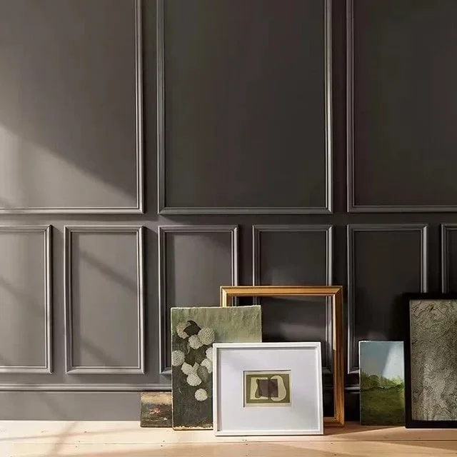
Layered Colour Schemes
It’s always about the layering. Rather than a single flat colour try layering tones across walls, woodwork, and furnishings. This creates depth and avoids the “one-dimensional” look that can make a room feel flat and unfinished.
Why Professional Input Matters
Many homeowners choose colours in isolation, leading to costly mistakes and spaces that don’t feel quite right. A well-designed scheme ensures that every element works together seamlessly, creating a home that feels cohesive and effortlessly put together.

Materials and finishes affect colour choices.
Remember your choice of flooring and tile is a colour too, consider colour as part of a whole scheme. Flooring, upholstery, artwork, and lighting all influence how a paint colour is perceived and works well when taken into consideration.
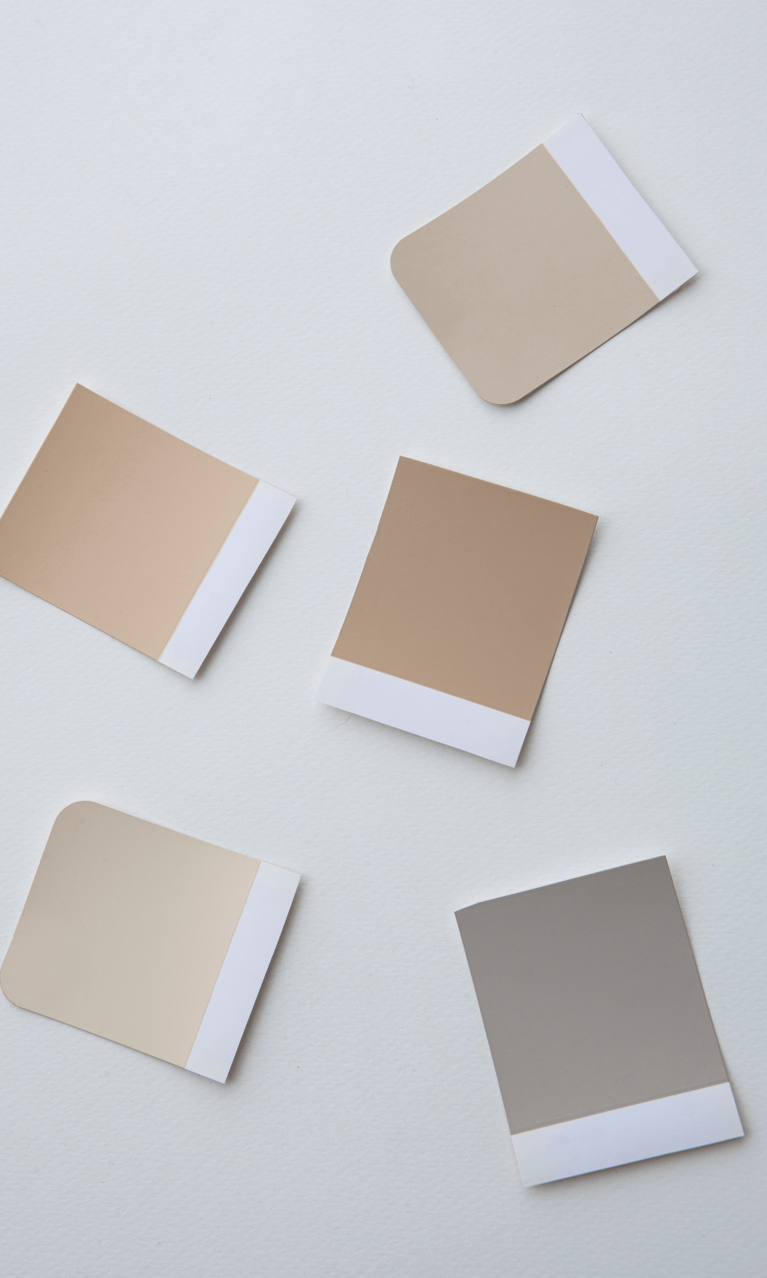
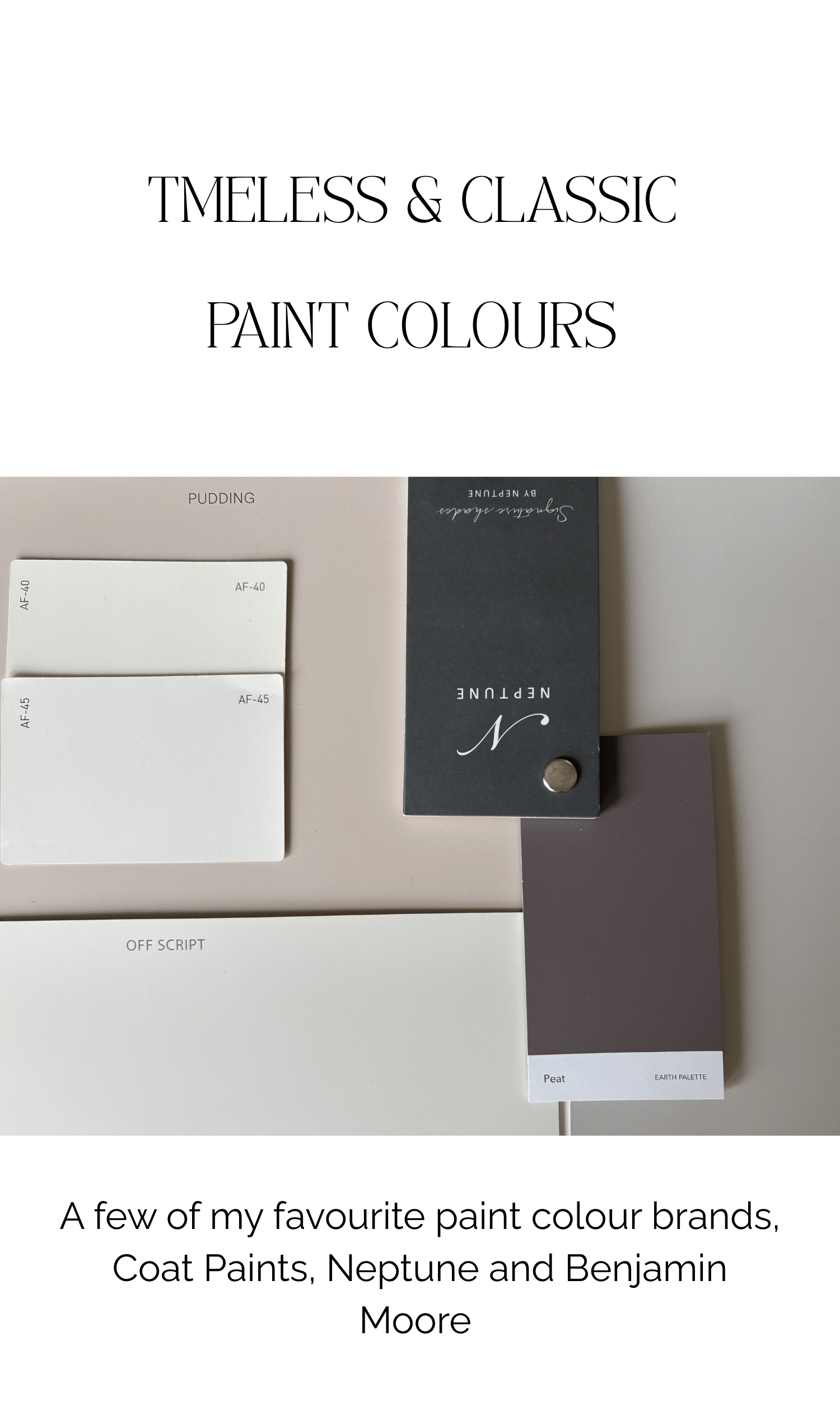
A Few Of My Favourite Colours To Try
I’ve listed a few of my tried and tested colours, some of which you may already have used and love. A favourite of mine, Benjamin Moore paint, available to buy here in Northern Ireland see link here»
Warm Neutrals (layering foundation)
Dulux Egyptian Cotton
A warm, creamy neutral that works beautifully in living rooms and open-plan spaces.
Use on: Main walls where you want a soft, welcoming backdrop.Farrow & Ball Skimming Stone
A refined greige with subtle warmth, elegant without feeling cold.
Use on: Walls and woodwork for a seamless, tonal look.Benjamin Moore Classic Gray OC-23
A very light, sophisticated neutral that shifts gently with the light.
Use on: Hallways and connecting spaces to keep everything feeling cohesive.
These colours work beautifully with light wood flooring.
Earthy & Grounded Tones (for depth and warmth)
Farrow & Ball Drop Cloth
A deeper, earthy neutral with a cocooning quality.
Use on: Snug rooms, dining rooms or hallways.Benjamin Moore Edgecomb Gray HC-173
A warm, sandy neutral that bridges classic and contemporary.
Use on: Open-plan spaces where you want subtle contrast without harshness. Not grey as we know it, A great neutral.Dulux Tranquil Dawn
A soft green-grey that brings a hint of nature indoors.
Use on: Bedrooms or calm living spaces.
Soft Colour (Subtle Colour Without Overwhelm)
For clients who want interest, but nothing too bold.
Farrow & Ball Mizzle
A muted green-grey that changes beautifully throughout the day.
Use on: Bedrooms, bathrooms, or cabinetry.Benjamin Moore Pale Oak OC-20
A warm neutral with a soft blush undertone.
Use on: Lounge and Family Rooms for cosy nights in, where you want warmth without obvious colour.
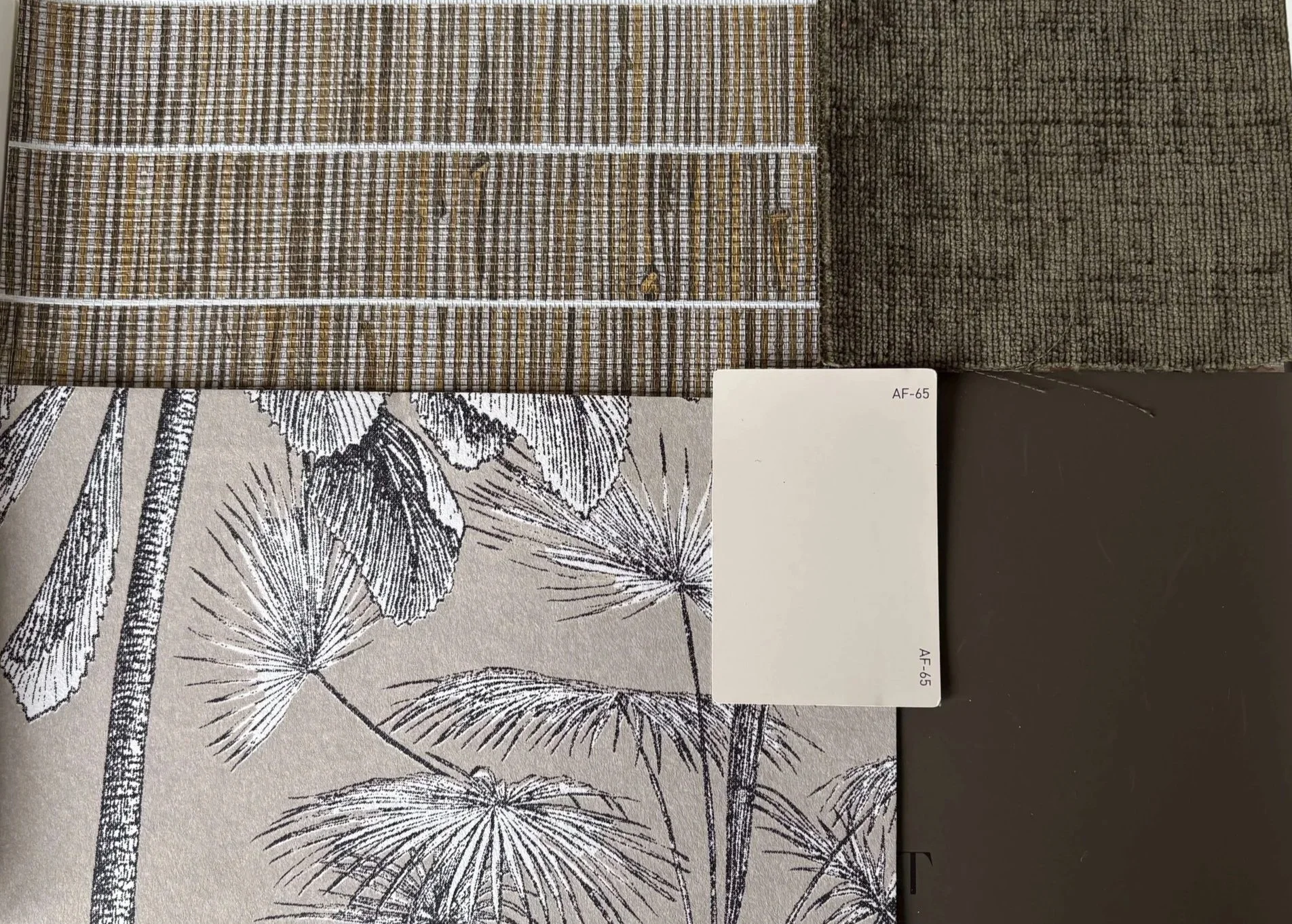
Benjamin Moore’s Colour of the year 2026. - Silhouette AF-655
Described as “Refined Elegance” I would add to that, grounding, cocooning richness This is how I would describe this paint colour, a strong neutral. But don’t take my word for it, you can find out more about this gorgeous colour HERE»
Benjamin Moore image sourced via web
My Guide For Using These Colours
Rather than choosing a single colour in isolation, build a palette:
Use one main neutral across larger areas for consistency
Introduce a slightly deeper tone to add depth in key spaces
Layer in a soft colour to bring personality and variation
Carry tones through woodwork, cabinetry, and textiles for a cohesive finish
This layered approach will help you create a home that feels considered, calm, and effortlessly put together.
“ Test your colours first in the room, monitor it in morning, afternoon and evening light. I like to paint two large coats of paint onto 2ft x 2ft square lining paper and move it around the room.”
What’s on My Desk
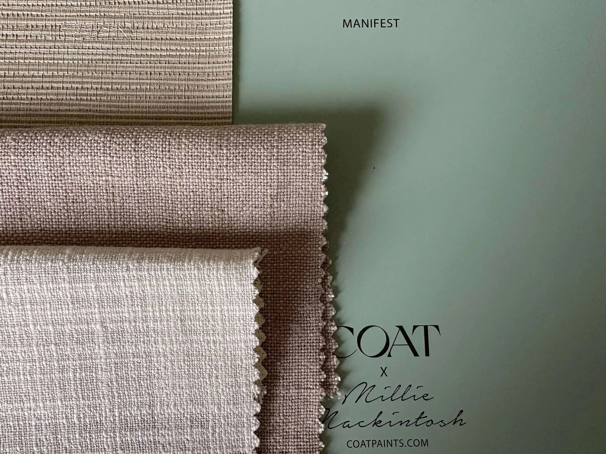
Well-being spaces. Soft greens with textured wallpaper and neutral soft curtain fabrics, perfect for practicing yoga and meditation.
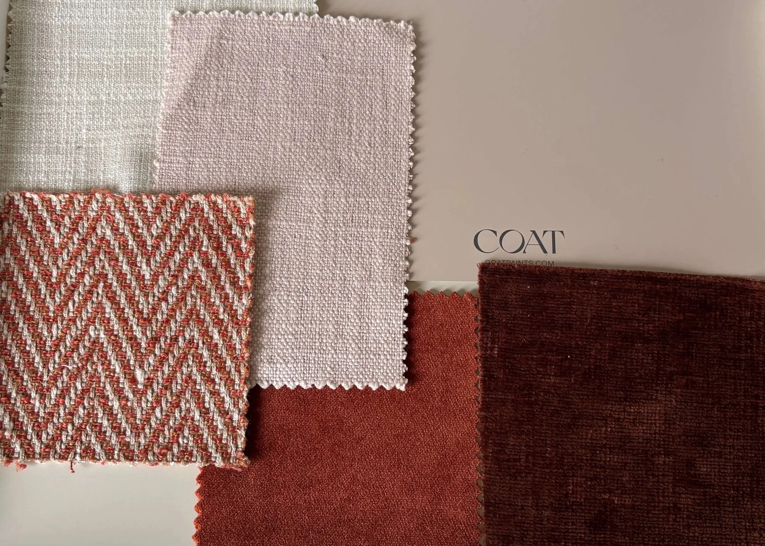
Warm cosy spaces using rich terracotta accents.
Mixing muddy greens in paint and upholstery with neutral textured walls.
If you’re planning to update your home and want to avoid the overwhelm of endless choices, a considered design approach can make all the difference. ensuring your home not only looks beautiful but feels right from the moment you walk in. Get in contact by clicking the button below.