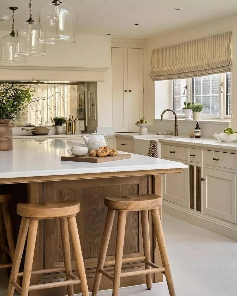
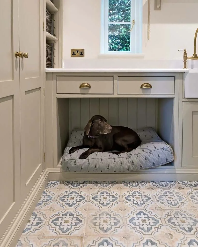
5 Timeless Neutral Paint Colours For A Fresh and Elegant Home
When you want to create a colour scheme for your home that feels fresh yet elegant without looking boring, choosing the right paint colour can feel surprisingly overwhelming — especially when every swatch looks the same after five minutes of staring at it.
But the right neutral? It sets the tone for your whole home. It makes everything feel calm, cohesive, and considered — without shouting for attention. These beautiful neutrals sit well with the scandinavian look, if that’s your style.
At Heather Interior Design, I always say: neutral doesn’t have to mean boring. These five timeless shades are the ones I reach for again and again when creating homes that feel elegant, welcoming, and easy to live in for years to come.
Here are my go-to favourites — all tested, trusted, and perfect for busy homeowners who want that wow factor without constantly redecorating.
Slaked Lime - Little Greene
Soft, natural, and beautifully balanced, Slaked Lime is a warm off-white that works just about anywhere.
It’s perfect for older homes with period features, and it adapts beautifully to natural light throughout the day.
Pair it with deeper taupes or dusky pinks for a classic, layered look.
Joa’s White – Farrow & Ball
Don’t be fooled by the name — Joa’s White is actually a warm, soft beige with a lovely red undertone.
It brings instant warmth to north-facing rooms and is a brilliant base for antique or wooden furniture.
I often recommend it to clients who want a cosy, timeless feel without going full-on “greige.” It’s an oldie but a goodie!
Swiss Coffee - Benjamin Moore
I love using Benjamin Moore paints and Swiss Coffee does not disappoint - it’s a beautifully soft, creamy off-white with just the right touch of warmth. It’s perfect for creating that gentle, elegant look that never feels cold or clinical — ideal for clients who want their home to feel calm and inviting. I often recommend this shade for open-plan spaces or older homes with lots of character, where a true white might feel too stark. It pairs wonderfully with natural woods, soft taupes, and muted greens, giving you a timeless backdrop that works season after season.
(Image credit: Stephanie Russo/Caitlin Flemming/Studio McGee)
Stony Ground - Farrow and Ball
A soft stone colour with a hint of warmth, this is a brilliant backdrop for art, fabrics, and natural textures.
It’s the kind of shade that makes a home feel finished — elegant but not fussy.
It works beautifully in older properties, especially when paired with white ceilings and woodwork. For a bolder look, this looks good with black skirting, architraves and doors.
As I’m sure you are aware, not all whites are the same and I would recommend you paint samples onto 2ft x 2ft card or paper (2 x coats - don’t skip this part, as the colour won’t read properly).
Quick Tips for Choosing Your Perfect Neutral
Always test paint in natural light and at different times of day
Use larger samples — not just a postage-stamp-sized swatch
Pair with your flooring and furniture — this is colour too, neutrals can shift dramatically depending on what’s around them.
Avoid going too cool in north-facing rooms — it can feel cold and flat
Feeling Stuck? - You don’t Have To Do This Alone
Choosing paint is just one piece of the puzzle — and I help clients take the guesswork out of all of it. From colour schemes to furniture, layout, and finishing touches, I create homes that feel effortless, elegant, and so you.
If you're ready for a home that finally feels pulled together (and reflects your style, not a trend), let’s chat.
Get in contact today — and let’s bring your home to life.


